Blood+ Production Report (5): Original Artworks
Hi, this is Peko again! Now that we are at our last appointment, I've just realized that when we talk about Ishii-san's job, we must not forget the "Original Artworks"! Put very simply, these are the anime-style illustrations that are made for promotion, DVD jackets, posters or merchandising. During the promotional campaign of a series, many artworks are order-made for anime magazines. For Blood+, most of the artworks made for magazines were actually drawn by other artists, but the promotional key visuals and DVD artworks were all strictly done by Ishii-san.
What the Animation Supervisor does: Original Artworks
Whew, this a really long explanation just to come to my question! Because now I would like to ask Ishii-san, which of these artworks do you recall the most?
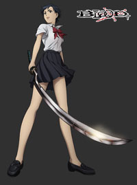
 | Well, maybe the first pinup poster. I'd say I rather have "regrets" than pleasant "recollections." When I was drawing Saya for that poster, I didn't really have a solid image of her in my mind. I asked people for opinions and advices while I was working on it. So when I look at it now, there are many things that bother me. I want to do touch ups myself! (lol) |

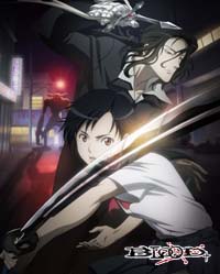
The second poster features Hagi as well, and he looks quite different from the first poster.
 | Ah, that one. I feel the look on Saya's face is odd. I only see awful things about my completed works... |
What? What do you mean, sir? I really love Saya in the second poster. Her pouty lips and everything, you know.

You said you can't see anything good about it, but don't you enjoy drawing artworks at all?
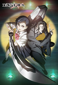
 | To say the truth, no, it's not something that I really enjoy. Although this might sound dull, I can't help but considering it as just part of my job. However, I can say that I was quite driven with the DVD Vol. 1 cover jacket. Ultimately, artworks come out better than my own drawings. |
What do you mean by "come out better"?
 | It might be due to the effects they add during the compositing process. The mood turns out better. The lighting for that poster, for example. I just would like to thank the staff. (lol) The finished product has a higher quality, so that's probably the fun part. |

Yes, they are always gorgeous! How Saya's sword shines for example.
Out of the numerous artworks, do you have a particular favorite?
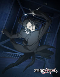
 | I would say the DVD Vol. 3. Hagi looks as if he is falling inside the tower. I sort of like that one. I'm a little nervous when I draw Hagi. I feel "I have to make him look cool!!" Hagi is by far the most popular character in Blood+ in the popularity poll conducted by anime magazines. |

Wow, even you get nervous! The pressure of working on popular characters sure is enormous. Those of you reading this, check out even the minutest details of the facial expressions next time you take a look at original artworks!
(5 - end)
© 2005 Production I.G · Aniplex · MBS · HAKUHODO

![WORK LIST[DETAILS]](/contents/works/design/images/left_title.gif)


 terms of use