![WORK LIST[DETAILS]](/contents/works/design/images/left_title.gif)


Making of Blood+ OP 3 - Part 1: Storyboard and Drawing
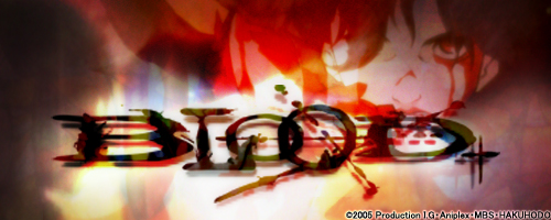
TV series Blood+ eventually featured 4 different opening films, directed by different creators with totally different graphic styles. All films have a slight twist to the ordinary, but the third version, seen from episode 26, somehow stands on its own. Accompanied by UVERworld's fast-paced music from the song Colors of the Heart, the characters of Blood+, reborn with a new brush touch, seem to wander into a kaleidoscopic picture book, where crayons and watercolors coexist with delicate 3D effects. This unusual and arty film of just 90 seconds, that was recently selected in competition for the 11th Holland Film Festival, obviously has an interesting production story behind it. So we have asked the staff to tell us more about their work.
Staff Profiles
Naoyoshi Shiotani
Sequence and animation director. Born in 1977, he's one of Production I.G's most promising young creators. His main works include Windy Tales (2004) and Blood+ (2006), and served as key animator in a number of I.G works, such as Otogi Zoshi (2004), The Prince of Tennis - Two Samurai: The First Game (2005) and Tsubasa Chronicle - The Princess of the Birdcage Kingdom (2005). He's a soft-spoken nice guy with a naughty boy inside.
Idumi Hirose
Color designer. Born in 1977, she created the colors for many well-known I.G titles, such as Dead Leaves, Innocence, Otogi Zoshi, xxxHOLiC and Le Chevalier D'Eon. Widely reputed Production I.G's super idol (as she would promptly confirm if asked). Nickname: Hokki.
Matty
Production assistant of undisclosed age. Before Blood+ he previously worked in Windy Tales. His trademark glasses and his distinctive humbleness made him a popular character. According to unconfirmed I.G in-house legends, last year he received the most Valentine chocolates in the entire studio, even outnumbering celebrated veteran animators. His recently adopted refreshing shaved head apparently improved his popularity.
Shiotani-san, we heard that this is your first stint at animation directing. How did you get around to doing this project?
Shiotani: Well, I first had an offer from animation producer Yutaka Omatsu. Well-known veteran animators created the first and the second versions (*). When they were planning the third, it seems that they decided to use one of the younger staff members in the studio. They told me they were looking for something different from the 1st and the 2nd versions, and from a standard opening sequence style as well, so I thought that might be fun and I accepted the offer.
So it was the producer Omatsu's idea in the first place.
Matty: When we asked Shiotani-san to take the job, I think we sort of knew it would be extraordinary. Then when he started to draw the storyboards, I seriously thought, "How could he go that far?"
Shiotani: When I was working on the storyboards, I sketched my ideas and asked, "Can I go ahead with this kind of flavor?" I was thinking of presenting something more like a design style of rough hand-drawn lines and colors. But if you change the lines, the characters look different, so I was careful not to let the characters drift towards something odd.

Matty: He even made a new character reference sheet only for this film. I was hearing him say, "No! No! No! They don't look the same!" no matter how many times he drew. Shiotani-san wanted to make sure people would recognize the characters and asked the staff around him to offer comments. I guess that was the process of deciding his own Saya.
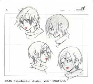
Shiotani: When I was working as animation supervisor for the episodes of the series, I personally got lost as to how I should establish these characters. So as for the opening sequence, I really wanted first to finalize the appearance of the characters that made sense to me.


How was the actual storyboard process?
Matty: Before drawing the first line, I felt Shiotani-san had a solid idea of what it was going to be like.
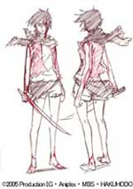
Shiotani: I already had some images of the scenes that I intended to do in my head. When we received the opening music score, I had a meeting with the director Fujisaku and producer Omatsu. The director gave me a rough storyline of the third quarter of the series and also the characters and their actual roles in the story. He requested that I illustrate "growth and transformation." As regards to "transformation, I particularly wanted to show the reason for the transformation. With this in mind, I gradually expanded the image of "my own Blood+ story." At first, I just drew a lot of drawings and then I listened to the music and rearranged the order of the drawings. With this, I created the storyboards. As for the costumes, I used character designer Chizu Hashii's drawings and arranged them in my own way.
Can you be more specific?
Shiotani: I included four images representing "growth." In the very beginning, I placed a scene in which you can't tell whether it's the past, present or future. This I processed to look like an old film. Then there is a departure from that. In the bath scene, I tried to hint that Saya and Diva's relationship could have been completely the opposite. Although you can't see now after the processing stages, Diva is looking at Saya, but Saya is not looking at Diva. And at the end, you see a contrast between Saya, the older sister, and Diva, the innocent little sister. I tried to illustrate psychological positions and distance between the characters in each drawing. Each small detail imparts psychological descriptions.
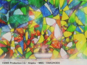


Storyboards are colored. This is not commonly done, is it?
Hirose: I requested it myself. When I got the job, I had no time at that point, but Shiotani-san pressed me, "You will do it, won't you?" (lol) That meant I had to deal with this specific style and those particular pencil lines. On top of that, the software used for digital painting was animo, that is renown for taking a lot of time. I realized that if the director did not have the definite colors right up front, he would take too long to decide, which would subsequently affect the processes that followed. So I requested that he let us know the color scheme when he created the storyboards. I thought that if he did not, then we'd never complete the project.
You have used primary colors in the storyboards and the anime itself.
Shiotani: I determined a theme color for each scene. I tried to make each scene's key element really stand out. But when I had some coloring in the anime I felt like changing and I asked Hirose-san to do that, she said, "OK, now you sit right beside me and tell me what you wanna do with these colors" (lol)
Hirose: (lol) This was the first time I worked with Shiotani-san, so I wasn't sure about his favorite colors. We had a very tight schedule. That's why I asked him to color the storyboards, so that I could forward his "idea of colors" to each section beforehand.
How was the actual process of drawing the scenes?
Shiotani: I asked the key animators to do rough drawings and I did the final lines to make all the lines consistent. You see, each animator has different tilt angles of pencils.
Matty: So Shiotani-san actually retouched all the lines.
Do you really mean all?
Shiotani: You can't just scribble the lines, you know. They should look as if they are in motion. And these motions should be accentuated and at the same time, look cool. This was only possible owing to Junko Nishimura's hard work; she supervised every single in-between drawing.
Hirose: It was Junko's decision to use the method that was used in the feature film Kill Bill: Vol.1. In the current project, we had three types of lines: lines to border color, the key lines and, the touch-up lines. Was this method first introduced in Kill Bill: Vol.1?


Shiotani: Not really. Studio Ghibli's Tonari no Yamada-kun (My Neighbors the Yamadas) used it too. In this project, we used three times more drawings for animated parts than usual, so the in-between section people might have had the hardest time. All in all, I feel we were able to take a risk and do all these things solely because it was the third opening sequence.
(*) NOTE: Version 1 was directed by Koh Yuh, and Version 2 by Kazuto Nakazawa.
(1 - continues)

 terms of use